|
HTML HTML5 HTMLタグ スマートフォン |
CSS CSSプロパティ CSS・HTML便利ツール |
HTML色見本 配色組み合わせツール 特殊文字 |
JAVA Android |
PHP Smarty修飾子 EXCEL |
*このページは web-dou.com のアーカイブです。(2025年 サイト統合)
アニメーション効果のCSSサンプル
TRANSITIONでアニメーション効果
+フォーカス時にアニメーション
あいうえお
.sample1 {
	margin:10px;
	padding:5px;
	background-color:#ddeeff;
}
.sample1:hover {
	background-color:#c1a1ff;
}
.tran1 {
	transition: all 1.0s ease-in-out;
	-o-transition: all 1.0s ease-in-out;
	-webkit-transition: all 1.0s ease-in-out;
	-moz-transition: all 1.0s ease-in-out;
	-ms-transition: all 1.0s ease-in-out;
}
<div class="sample1 tran1">あいうえお</div>
あいうえお
.sample2 {
	margin:10px;
	padding:5px;
	background-color:#ddeeff;
	border-radius:10px;
	border:1px solid #ddd;
}
.sample2:hover {
	background-color:#c1a1ff;
	border-radius:50%;
	border:5px solid navy;
}
.tran1 {
	transition: all 1.0s ease-in-out;
	-o-transition: all 1.0s ease-in-out;
	-webkit-transition: all 1.0s ease-in-out;
	-moz-transition: all 1.0s ease-in-out;
	-ms-transition: all 1.0s ease-in-out;
}
<div class="sample2 tran1">あいうえお</div>
文字が拡大するアニメーションメニュー
.menu1 {
	margin:10px;
	padding:5px;
	background-color:#ddeeff;
	border-radius:10px;
}
.menu1 li {
	font-size:10pt;
	transition: all 0.5s ease-in-out;
	-o-transition: all 0.5s ease-in-out;
	-webkit-transition: all 0.5s ease-in-out;
	-moz-transition: all 0.5s ease-in-out;
	-ms-transition: all 0.5s ease-in-out;
}
.menu1 li:hover{
	padding:20px 50px;
	font-size:40pt;
	background-color:#ccddff;
	text-shadow:0px 0px 10px #fff;
	font-weight:bold;
}
<ul class="menu1">
<li><a href="/" title="top">あいうえお</a><li>
<li><a href="/app/web-dou/html/" title="HTML">かきくけこ</a><li>
<li><a href="/css/" title="CSS">さしすせそ</a><li>
</ul>
あいうえお
かきくけこ
さしすせそ
たちつてと
.sample3 span{
	display:inline;
	color:navy;
	transition: all 0.5s ease-in-out;
	-o-transition: all 0.5s ease-in-out;
	-webkit-transition: all 0.5s ease-in-out;
	-moz-transition: all 0.5s ease-in-out;
	-ms-transition: all 0.5s ease-in-out;
}
.sample3 span:hover {
	font-size:40pt;
}
<ul class="menu1">
<li><a href="/" title="top">あいうえお</a><li>
<li><a href="/app/web-dou/html/" title="HTML">かきくけこ</a><li>
<li><a href="/css/" title="CSS">さしすせそ</a><li>
</ul>
画像を拡大・回転するアニメーション
.img_box {
	height:115px;
	text-align:center;
}
.img1 {
	width:100px;
	height:57px;
	box-shadow:0px 0px 10px 3px #999;
	transition: all 0.5s ease-in-out;
	-o-transition: all 0.5s ease-in-out;
	-webkit-transition: all 0.5s ease-in-out;
	-moz-transition: all 0.5s ease-in-out;
	-ms-transition: all 0.5s ease-in-out;
}
.img1:hover {
	width:200px;
	height:113px;
	box-shadow:none;
	border:1px solid #999;
	-webkit-transform: rotate(-13deg) skew(-20deg,22deg);
	-moz-transform: rotate(-13deg) skew(-20deg,22deg);
	-o-transform: rotate(-13deg) skew(-20deg,22deg);
}
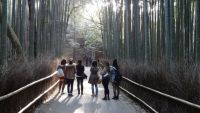
<div class="img_box">
<img src="/app/web-dou/sample/img/sample3.jpg" alt="竹林" class="img1" />
<img src="/app/web-dou/sample/img/sample4.jpg" alt="京都" class="img1" />
</div>
Copyright(C) 2010 WEB道 All Rights Reserved. Last update 25/12/01 14:52